Sunday 5 November 2023

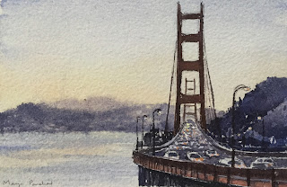
Golden Gate Bridge - A watercolor painting on Chitrapat handmade paper

 “ Watercolor condenses time and consolidates experience.” Frank Marcello

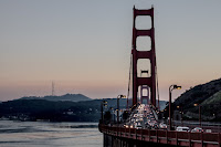
 PIXABAY is a free stock photography and royalty free stock media website. It is used for sharing photos, illustrations and a lot more, under the custom PIXABAY License, which generally allows the free use of material with some restrictions. I personally enjoy browsing through this site for some interesting reference photos of places that I haven’t visited so far but would love to paint them anyway.

I have already painted the “Golden Gate Bridge” ( “A suspension bridge that connects the San Francisco Bay and the Pacific Ocean. ) on earlier occasions but the photo that I found recently caught my eye mainly because, it had quite a different composition as it was an evening scene and also captured the cars racing across the bridge. This scene looked a bit challenging as I decided to use the watercolor medium and had to capture the racing cars, which were going to be gestural strokes and not too much of details. 

I finally painted it on Chitrapat handmade paper using my usual Winsor and Newton Cotman and Camlin Artists water color tubes. 

After having completed a painting, every artist looks back and reflects on the entire process of creating it. I do the same. I haven’t painted this kind of a scene before and by the time I completed it, I was happy. Trying something new and different is always very exciting. It motivates you further to pursue the journey. 

Watercolor painting of Golden Gate Bridge on Chitrapat handmade paper

The Golden Gate Bridge
A water color painting on Chitrapat handmade paper 
Size 4” X 5”

Golden Gate Bridge from PIXABAY

The Golden Gate Bridge 
Courtesy: Pixabay.com

If you wish to see my recent artworks visit my INSTAGRAM site and if you like my works and they inspire you, please share with friends. Thanks for visiting my blog and browsing through my artworks. 

Friday 11 August 2023

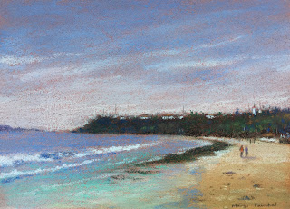
“Beach Reflections” A soft pastel painting on Canson Mi Teintes paper

 “ Limitless and immortal, the waters are the beginning and end of all things on earth.” Heinrich Zimmer

Somewhere in December 2019, I was at Bogmalo beach ( Goa ), with family to attend a marriage function. Little did we know of what was in store for us in the coming months. And then in 2020, Covid struck and all traveling came to a halt for a long long time. Therefore this beautiful beach is a reminder of the pre covid carefree era, when I took out time one early morning to walk along the shoreline and capture some lovely photographs which I planned to paint later at leisure. 

Today’s soft pastel painting of an early morning scene at Bogmalo Beach is one of the many paintings that I have created in the recent times. What I loved a lot in this particular capture is the reflection of the distant hills reflecting on the water reaching the shoreline. 

Soft pastel painting of Bogmalo beach on Canson Mi Teintes paper

“Beach Reflections”
A soft pastel painting on Canson Mi Teintes paper
Size 5” X 7”

Like in any typical soft pastel painting, I have used Canson Mi Teintes paper and my usual Mungyo, Kohinoor Toison Dor and Sennelier pastels. These pastels work great in combination and as of now I am pretty content with my collection and do not wish to add any more.

If you wish to see some of my latest artworks you can visit my Instagram site wherein I post my works more regularly. Thank you for browsing through my blog. 🙏

Friday 3 February 2023

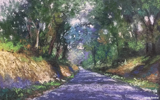
Step by Step, soft pastel forest landscape ( Coorg, Karnataka )

 “Perfection is no small thing but is made up of small things.” Michelangelo 

Of late, I have been pretty busy with my water color paintings but I do miss working with soft pastels. So took out some time recently and created this forest landscape referring to my photo taken at Coorg, Karnataka. 

I have used the following brand of soft pastels as:

1. Camlin
2. Mungyo
3. Gallery

Each of these brands have their own qualities and together they work great for me. If I have to recommend one brand to buy as a set for the beginners, I would suggest set of 48 soft pastels by Kohinoor Toison Dor. These cylindrical sticks are absolutely soft on the paper and work wonders. Moreover they are economical too. As far as paper is concerned, I mostly go with Canson Mi Teintes as I find it economical and it has sufficient tooth for taking in two layers of pastels. I normally finish my work in two layers and additionally do a little touch up in the end using the extra soft Sennelier pastels.

soft pastel landscape painting on Canson Mi Teintes paper

“ On the way to Coorg”
A soft pastel painting on Canson Mi Teintes paper
Size: 7” X 9”

I have visited Coorg several times in the past and every time I am there it feels absolutely amazing. There is something magical about the nature vibes. It rejuvenates you to the core.

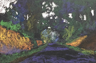
The Steps involved in creating the above artwork


Step 1.  Created a faint basic outline of the major shapes using a light coloured 
soft pastel pencil and later used the Mungyo and Kohinoor 
soft pastels to paint the respective tonal values keeping
in mind the source of light, and the shadows.

Step by step soft pastel painting on Canson Mi Teintes paper

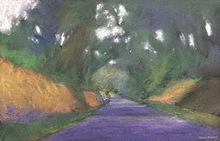
Step 2. After the first layer of color application ( using soft touch, as Canson Mi Teintes
cannot take in too many layers of colors ), I blended the colors 
on the paper using my finger tips to cover up the underlying
black shade of the paper. 

soft pastel landscape painting on Canson Mi Teintes paper

Step 3. After the first layer was painted and blending is complete, I carefully began with 
the background sky and slowly worked my way towards the forest 
trees and other elements as I progressed downwards towards 
the foreground. I used Kohinoor soft pastel pencils to create
the fine branches, and other details ( mostly in the
middle ground ) 


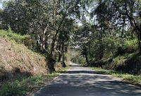
The reference photo taken at Madikeri ( Coorg, Karnataka )

Follow my latest works and techniques on INSTAGRAM and if you love my works and they inspire you, share them with your friends. Thanks for taking out time and browsing through my blog 🙏

Sunday 28 August 2022

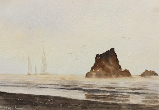
Seascape - A water color Painting on Chitrapat handmade paper

 “Translucence is an effect unique to the medium of watercolor and the lure that beckons me into the studio for yet another creative adventure.” Michele Cooper

Using Chitrapat handmade paper has always been a delight. I have written a lot already about the advantages of using this paper in my previous posts and I personally use this paper a lot. Apart from this paper I also like using Arches cold pressed paper and Fabriano Acquarello paper. 

For the painting below I have used very few colors, namely raw sienna, burnt sienna, orange and ultramarine blue. Using wet on wet wash technique, I initially painted the sky, the ocean and the sandy beach. Then I let the paper dry. Later I used ultramarine blue and burnt sienna to create the rocky structures in the distance, followed by the ocean and the beach. I also added few sailboats in the distance, using a very dilute wash of ultramarine blue and burnt sienna. The reflections of the rocks were added pretty much in the end. Can you also spot the birds flying in the sky? It was fun painting this seascape which has an overall warm tone and I forgot to mention that I have used Winsor and Newton Cotman paints and Camlin Artist watercolor tubes for this work. 

Watercolor painting of seashore on Chitrapat handmade paper

Evening Glow
A water colour painting on Chitrapat handmade paper 
Size 5” X 7”

In most of my posts, I have given a brief description about the paper and paints used by me. However I failed to write about the brushes I use in order to create them. In one of my upcoming posts, I shall try and give a detailed description about the different brushes used by me.

Follow my latest works and techniques on INSTAGRAM and if you love my works and they inspire you, share them with your friends. Thanks for browsing through my blog and being a part of my art journey 🙏

Wednesday 10 August 2022

Senibel beach Florida , Step by step watercolor painting

Limitless and immortal, the waters are the beginning and end of all things on earth.” Heinrich Zimmer

My today’s post is a small water colour painting that I created recently on Campap watercolor paper. I posted it on my INSTAGRAM feed a while ago and decided to blog about it as I captured the steps involved in creating it. This Senibel beach scene from Florida is inspired by a photograph from @tryatrip and I am grateful for the same. Most of the times, I try using my own reference photo, however there are times when I come across something beautiful which I cannot resist and therefore go ahead and paint it.

If you have been following my works on INSTAGRAM you would know that I am a lot into Chitrapat handmade paper for my watercolor paintings which is really a great economical paper to start with but sometimes I do try on other papers which are in my collection and are fairly good.

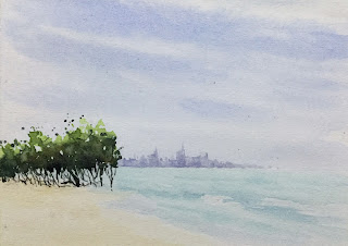
Step by step Watercolor painting of Senibel beach, Florida
                                                               
                                                                 Senibel beach, Florida
                                                   A water colour painting on Campap paper   
                                                                       Size   4” X 5.5”
                                            
Step by step watercolor painting by Manju Panchal

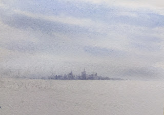
Step 1. Sky and distant buildings

Step 1. I wet the paper using clean water and then using a round brush created
the sky with ultramarine blue color. While the paper was still wet I 
added the distant buildings using a small flat brush ( Ultramarine blue and light red mix )
 I darkened the pigments at places using a thicker mix of paints to create 
different tonal valuesto suggest the towers in the distance.

Step by step watercolor painting by Manju Panchal

Step 2. The sea and the foliage on the left

Step 2. I now wet the lower section of the paper to create the ocean and 
ocean waves. I have used a mix of ultramarine blue and viridian green
for the sea waves and raw sienna for the seashore. Once the ocean was done,
I used wet on dry technique to create the foliage and branches on the 
left. I created the greens using chrome yellow and ultramarine blue.
In greens, I like the Hookers green from Camlin. I mix it
with a cool or warm color to create the shade I desire.
For the thin branches, I normally use my rigger brush
in the end.

For the final step, I added a few rocks and twigs on the sand. ( The Final painting as displayed on the top ). The wet sand next to the waves gets a reflection of sky color for which I have used ultramarine blue and light red mix from Camlin. That about completes the painting. If you happen to miss out on leaving the white of paper for the froth on seawaves, you can apply white paint directly from the tube using a stiff synthetic brush. ( I do it all the time. I have used masking fluid in the past, but from my experience I have realised that they all dry up if not used frequently and it is an expensive affair. So these days I avoid buying it. )

Follow my latest works and techniques on INSTAGRAM and if you love my works and they inspire you, share them with your friends.

Monday 3 May 2021

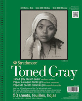
Why I love using Strathmore toned paper

 “A beautiful body perishes, but a work of art does not.” Leonardo Da Vinci

Today apart from posting my two more drawings in the “Sparrow series”, I decided to dedicate this post to “How and when I started using Strathmore toned paper” and “what I love most about it”. To be frank, it’s been years and it is difficult to keep a track of lots of things that have happened while I have been moving ahead in my art journey. Therefore my BLOG and INSTAGRAM help me go down the memory lane to browse through the recorded facts and I feel so grateful that I started sharing my artworks with the art community from around the world.

After checking the data I realised that my earliest drawing of “Eye Study” was posted on April 17th, 2017. So it was definitely around that time when I visited Art Lounge, which during those days was situated at Churchgate. I along with a friend of mine had traveled by local train to do our yearly “Art Stationery Shopping”. It see to be fun. I had seen some lovely charcoal and graphite drawings on Strathmore paper and that inspired me to one for myself and check it out. My first pad that I purchased, as shown below, continues to be used even today as there are still some papers left in it.

Strathmore gray toned drawing paper pad

Strathmore gray toned paper pad
( 50 sheets )

My fascination for the subject “Sparrow” started after I started having plenty of sparrows all of a sudden in my balcony. It has been a pleasant change and I wake up to chirping of this beautiful species and it’s such a great way of starting the day. Sometimes I just quietly stand at one corner and watch their playful activities. 

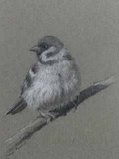
For both the “Sparrow sketches” as given below, I have used Camlin graphite pencils namely 3B, 6B and 9B. For white pastel shading I have used Conte A Paris and General white pastel pencil. For my earlier sketching I experimented with combining graphite with Staedtler charcoal pencil, however I realised the blending does not go well. So I decided to keep my artwork limited to plain graphite strokes.

A graphite drawing of a sparrow on Strathmore toned paper

Holding on
A graphite drawing on Strathmore drawing paper
Size 4” X 5.5”

A graphite drawing of a sparrow on Strathmore gray toned paper

Balancing Act
A graphite drawing on Strathmore drawing paper
Size 4” X 5.5”

My personal review about STRATHMORE GRAY TONED DRAWING PAPER and why I love using it for my graphite and charcoal drawings 

1. It is 100% recycled, contains 30% post consumer fibre and is acid free.
2. The paper works great with graphite, charcoal, color pencils, ink etc and is very versatile.
3. It has a smooth surface and very fine texture which helps in holding the graphite and charcoal medium 
    pretty well.
4. Strathmore toned paper is available in two shades, gray and tan, which work as mid tone values. This
    makes it easier to judge the dark and light values and saves a lot of time as we need to apply only the 
    lighter and darker tones.
5. The paper is 118 gsm and this thickness is perfect to create some great artworks.

If you wish to see my recent artworks visit my INSTAGRAM site and if you like my works and they inspire you, please share with friends. Thanks for visiting my blog and browsing through my artworks. 


Wednesday 28 April 2021

Watercolor thumbnail sketch to simplify the painting process

It is not the ship so much as the skilful sailing that assures the prosperous voyage.” George William Curtis

Water color medium by itself is challenging medium as compared to others. Therefore before attempting the final painting, I love to explore the different possibilities by doing small “Thumbnail sketch” or “Preliminary Study”

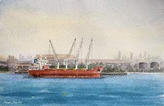
The subject “Cargo Ship” is a little out of my comfort zone and moreover it also involves the understanding of ship structure in general. Therefore, I felt it appropriate to create the two “Thumbnail sketches” as below to visualise the final painting. It also helps me to simplify a very complicated painting and most importantly it is a great mental warm up exercise.

 Both works are created on Chitrapat handmade paper which is made of 100% cotton fibreand very economical too. CLICK HERE to know more about this paper.

For both the paintings as shown below I have used a limited palette of Camlin Artists water color tubes namely

1. Ultramarine Blue

2. Raw Sienna

3. Burnt Sienna

4. Light red

5. Permanent orange

6. Chinese white ( for highlights )


Watercolor painting of Cargo ship at sea, by Manju Panchal

Cargo vessel out at sea
A thumbnail sketch on Chitrapat handmade paper 
Size 2.5” X 4”

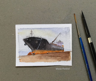
A water colour painting of cargo ship at port, on Chitrapat handmade paper

A Bulk Carrier at the port
A thumbnail sketch on Chitrapat handmade paper 
Size 3” X 4.5”

Box Palette with Camlin Artists water colour tubes

My Palette with Camlin Artists water
Colour tubes which I normally use for 
Thumbnail sketches


Chitrapat handmade paper pad
Purchased online from MAXA-ENTERPRISES 

During my initial years of painting I was unaware of the advantages of creating thumbnail sketches/preliminary studies. As I progressed in my journey I got inspired by a lot many experienced artists who advised on following this routine in order to plan and research an artwork beforehand. It made a lot of sense to me and initially it was not easy to adapt to this routine as this involved additional effort of creating a complete painting in a small size. Some of my initial attempts were pretty disappointing but as time progressed, I got more comfortable in creating small thumbnail works which are either 3” X 4” OR 4” X 5.5”.

Sometimes I feel that my thumbnail works which are done so spontaneously, without any fear of getting wrong, have that freshness and energy in them which sometimes goes lacking in the larger version of the same artwork. 

Follow my latest works and techniques on INSTAGRAM and if you love my works and they inspire you, share them with your friends.

Thank you for browsing through my artworks and I appreciate your support in my art journey.

Sunday 25 April 2021

Sparrow - A Graphite drawing on Strathmore gray toned paper

 “A bird sitting on a tree is never afraid of the branch breaking, because her trust is not on the branch but on its wings”

If you are following me on INSTAGRAM , you probably must have already gone through my recent graphite drawings on “Sparrow series”. ( I have to admit that I have been more regular on my Instagram as compared to my blogging. I wish I could dedicate more time to writing in my blog. )

After having done watercolor medium for months, I suddenly felt the need to take a break and so decided to get back to my toned paper drawing and sketching. As far as stationery is concerned, I have enough of art materials for every possible medium. ( Over a period of time I have accumulated a whole lot of pencils, papers, paints and brushes and it helps because in COVID situations it is not easy to procure the desired materials easily. )

When it comes to toned paper, the two papers that I absolutely love and recommend to everyone are

1. Strathmore toned paper ( Gray and Tan shade )

2. Canson Mi Teintes paper ( Beige and Gray shade )

For my “Sparrow series” I decided to go with Strathmore gray toned paper as I wanted to create soft strokes of graphite and white pastel pencil. The smooth textured surface of the paper, I felt was ideal for these drawings.


Graphite drawing of a sparrow on Strathmore gray toned paper

“Just Relaxing”
Graphite/ Charcoal drawing on Strathmore Gray toned paper
Size 4” X 5.5”

Graphite drawing of a sparrow on Strathmore gray toned paper

“Sparrow on the tree”
Graphite drawing on Strathmore Gray Toned paper
Size 4” X 5.5”

pencil


The Strathmore pad with
Gray toned papers
Purchased from Art Lounge

These days I try to limit myself to using minimum art stationery in order to keep my working process simple. In both the above drawings I have used 3B, 6B and 9B graphite pencils and Creatacolor and General white pastel pencil


Pencils used 1. General white pastel pencil
2. Cretacolour white pastel pencil
3. Camlin 3B graphite pencil
4. Camlin 6B graphite pencil
5. Camlin 10 B graphite

In addition to the above, I also keep a simple pen pencil which I normally use in the beginning to create a very faint outline of the subject. If you are a beginner, my suggestion is to practise using simple materials available at home and once you feel you enjoy working on toned paper then go ahead and add a few products. When I first got into toned paper artworks, I remember using simple handmade coloured papers with rough surface and it cost me just about 20 to 30 Indian Rupees a sheet. CLICK HERE  to browse through my initial experimental works on handmade paper.

Thanks for visiting my blog and if you wish to purchase any of my original artworks, you can mail me at manjupanchal5@gmail.com and I shall get back to you as soon as possible.

Friday 13 November 2020

Online Charcoal drawing Class/Workshop using Zoom App

“Drawing is the ‘bones’ of art. You have to be able to walk before you can run.” Dion Archibald

 Charcoal is probably one of the oldest art materials and is very versatile in nature as a medium. It helps an artist do quick drawings in expressive strokes and the final black and white artwork is so impressive that one easily gets addicted to it. I am one of them. I took to this medium about twenty years back and I continue to be fascinated by it. Some of the advantages of this medium which I feel I need to share with the viewers are as following-

  • Great help in creating tonal value drawings
  • Helps simplify a complicated scene
  • The bold, sweeping strokes helps an artist develop his/ her unique style
  • Being a dry medium, it is easy to make corrections 
  • Very Economical
  • Can be carried easily for outdoor/ plein air works
  • It is a fast medium to work with ( Especially if one is doing preliminary study works )

Before the COVID lockdown, I was busy taking private workshops at my studio at home. However now I have started “Online Charcoal drawing and sketching workshop” using ZOOM app. 

Apart from teaching the basics involved in creating a charcoal artwork, I shall also demonstrate step by step, one of the charcoal drawings as shown below. It will be a very interactive session wherein I shall be answering all the queries pertaining to this medium and will also share my personal tips and techniques which I have developed over a period of time. If you wish to attend my charcoal workshop in a group or one on one basis, mail me at manjupanchal5@gmail.com or call me at 91- 9082690127

Charcoal demo painting during online charcoal workshop using zoom app

Charcoal demo painting during online charcoal workshop using zoom app

Charcoal demo painting during online charcoal workshop using zoom app

Some of the basic tools that I shall be using during my demonstration 
for creating the charcoal sketch 


A . Soft piece of cloth used for blending purpose
B. Kneaded Eraser
C.Tortillon ( blending tool )
D. Charcoal powder
E. General very soft charcoal pencil
F. Camlin soft charcoal pencil
G. Willow charcoal 

Most of the above mentioned materials are easily available on online stationery stores like AMAZON

CLICK HERE to read in detail about the charcoal tools as I have already created a post in the past.

Follow my latest works and techniques on INSTAGRAM , where in I post my latest artworks regularly. 

Wednesday 11 November 2020

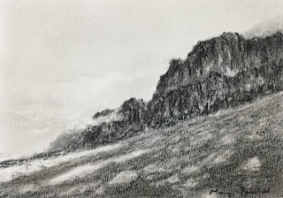
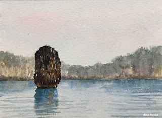
Limestone Rocks and cliffs ( Vietnam )

“Watercolor condenses time and consolidates experience.” Frank Marcello

 While at Cam Pha sea port during his last voyage, my husband got to witness the beautiful prehistoric “Limestone Rocks”, it’s reflections and the sudden ripple in the waves caused by a passing vessel. His cargo ship had arrived there at inner anchorage for loading cargo for the next destination. He sent me a few photographs of these stunning rocks and cliffs, which dotted the sea all around and I used them as a reference to create the two water colour paintings as below. 

As mentioned in my earlier posts, I have got pretty much used to working on Chitrapat handmade paper and have taken a strong liking to it. My technique involves working wet on wet and this paper holds a lot of water and stays wet for a longer time. It’s acid free and is made of 100% cotton fibre. It works good for me. I purchase Chitrapat paper from maxa-enterprises ( online store at Pune ), however there a lot many online stores today who sell the same paper so it’s great that one can easily order it online.

Limestone rocks at Cam Pha port, a water color painting

Limestone Rocks at Cam Pha Sea Port
A water colour painting on Chitrapat handmade paper 
Size 5” X 7”

Wave Ripples - A watercolor painting on Chitrapat handmade paper

Wave Ripples
A water colour painting on Chitrapat handmade paper 
Size 5” X 7”

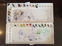
For most of my watercolor paintings, I use a mix of Winsor and Newton and Camlin Artist watercolor tubes. They are both good in their own ways. If you are a beginner, I would personally recommend Camlin tubes as it is very economical and has great quality too. Given below are my two palettes which I use for both these brands. I like the Majello palette for its large working space instead of having small wells.

Mijello Palette with Winsor and Newton cotman tubes

Mijello Palette ( Winsor and Newton watercolors )

Mijello Palette

Mijello Palette ( Closed )

Watercolor palette with Camlin Artist’s water color tubes

Palette with Camlin Artist’s water color tubes

Follow my latest works and techniques on INSTAGRAM and if you are interested in attending my online demo workshop send me a mail at manjupanchal5@gmail.com and I shall get back to you with details about the same.

Sunday 8 November 2020

Ship at berth - A water color painting

 “Watercolor can leave me totally deflated and wondering why I chose it as a medium and then I am seduced again by a beautiful wash or the lacework of an intricate detail which is impossible to create in any other medium.” Joseph Zbukvik 

Last year I had the opportunity to visit my husband’s ship which had arrived at New Mangalore port for loading cargo in bulk. One morning when I got up and looked out of the porthole, I saw this “Bulk Carrier” parked at the jetty on the opposite side. It had probably arrived at night for loading. The atmosphere was a bit hazy I loved the scene, the mood and the composition. I had decided then that someday I shall paint the story of this ship. Painting is quite like story telling. I paint what is on my mind and leave the rest to the viewer to interpret it in his/her own way.

I am shuffling between Chitrapat handmade paper and Arches Cold pressed paper as both of them are my personal favourites now. Chitrapat paper is more reasonable as compared to Arches, however for this artwork I wanted to use Arches paper and undoubtedly, using a quality paper makes a big difference. The ship was the focal point of this painting and for the rest of the port infrastructure on the right, avoided too many details. It gave an abstract feel to the painting and I loved the way it turned out.

For most of my water color paintings, I like to use very limited Colors in the palette. For this work I have mainly used ultramarine blue, burnt sienna, raw sienna, permanent orange, and light red. Lesser Colors in the palette, I feel, helps simplify the painting process.

A Ship at berth , A watercolor painting on Arches Cold pressed paper

Ship at Berth
A water colour painting on Arches CP paper
Size 5” X 7”

A Bulk Carrier at Mangalore Port

Reference photo taken at 
New Mangalore port

I have already created a few water color paintings in my “Ship series” and plan to create some more very soon. I have also started doing charcoal tonal value sketches of ships and some are already posted on my INSTAGRAM feed. Do check them out.

Thank you for browsing through my artworks and I appreciate your support in my art journey.

Friday 6 November 2020

Charcoal drawing of a forest scene on Strathmore 300 series drawing paper

“There’s nothing like drawing a thing to make you really see it.” Margaret Atwood 

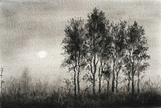
Years back, I got into charcoal medium and got fascinated by it versatility. Initially I started off with just a pencil and charcoal powder but as years progressed, I went on to explore different tools and developed my own technique to create my Charcoal drawings

Presently I am more into water color paintings which is one of the most challenging mediums, however I do take out time in between to get back to my charcoal art. It’s a very satisfying experience as it helps in simplifying a complicated composition. Once I know my basic tonal values of the subject, it makes it easier to paint the scene using any other medium. 

Posted below are two of my charcoal drawings of  “Forest scenes”, with reference to my travel photographs.

Charcoal drawing of a forest scene on Strathmore drawing paper

A walk along the road 
A charcoal drawing on Strathmore drawing paper 
Size 4” X 5”

Charcoal drawing of a forest scene on Strathmore drawing paper

Along the road
A charcoal drawing on Strathmore drawing paper 
Size 4.5” X 5.5”

There are some charcoal tools which I use on a regular basis as shown below and these are easily available on Online stores.

Charcoal pencils, blending tool and kneaded eraser

Camlin and General charcoal pencil
Blending tool
Kneaded eraser

Charcoal powder used for charcoal drawing

Charcoal powder 

Willow charcoal

Willow charcoal 
( Local Chinese brand )

On December 2016, I created a detailed post regarding the common tools used by me for my charcoal drawings. CLICK HERE to browse through the same.

If you wish to see all my artworks in Gallery format, visit my INSTAGRAM site where I post my works on a regular basis. Thanks for visiting my blog and browsing through my artworks. 

Sunday 18 October 2020

One Step at a time - A soft pastel painting

“ You can get anywhere if you simply go one step at a time.” Dave Ramsey

Sometime back I tried this soft pastel painting on Canson Mi Teintes light grey toned paper. Every landscape scene has its own challenges. What I loved in this scene was the steps leading into the forest and the misty background. I used muted grey toned colors in the distance to create depth and used light strokes of pastels to create the branches and foliage.

I normally work with a mix of different brands of soft pastels, namely Kohinoor Toison Dor, Mungyo and Sennelier. Out of these if I have to recommend one brand which is great quality apart from being economical is Kohinoor Toison Dor.

Sennelier is extra soft and it easily blends into the paper and I love its quality, however it is far more expensive than other brands. I normally use it as a last layer to apply finishing touches to my painting.

A soft pastel painting of forest scene on Canson Mi Teintes paper

One Step at a time 
A soft pastel painting on Canson Mi Teintes paper
Size 5” X 7”

I created a post regarding the use of different papers I use for my soft pastel paintings. CLICK HERE to view the same.

If you wish to see all my artworks in Gallery format, visit my INSTAGRAM site where I post my works on a regular basis. Thanks for visiting my blog and browsing through my artworks. 


Friday 16 October 2020

Afloat - A soft pastel painting on Canson Mi Teintes paper

In nature, nothing is perfect and everything is perfect. Trees can be contorted, bent in weird ways, and they are still beautiful.” Alice Walker

A log of wood, floating in the still waters at the banks of Kaveri river near Dubare Forest in Coorg. The moment my eyes captured this sight, I knew I had to paint it some day. I decided to go with the soft pastel medium for this work as I wanted a dark background which can be achieved so well using my newly purchased Sennelier pastels from Creative hands online store. The log of wood was half immersed in the water and the light and shadow play gave a new definition to the entire set up.

I scraped an old white pastel to create the sparkles on the water. Apart from using my usual Mungyo and Kohinoor Toison Dor soft pastels, I also use pastel pencils from Derwent as it helps to create some sharp details like grasses and twigs.

A soft pastel painting of a scene from Coorg on black Canson Mi Teintes paper

Afloat
A soft pastel painting on Canson Mi Teintes paper
Size 4.5” X 6.5”

Sennelier extra soft dark pastels
Sennelier extra dark soft pastels

If you wish to know about the papers I use for my soft pastel paintings CLICK HERE. I have created a post regarding the same in 2016. 

If you wish to see all my artworks in Gallery format, visit my INSTAGRAM site where I post my works on a regular basis. Thanks for visiting my blog and browsing through my artworks.